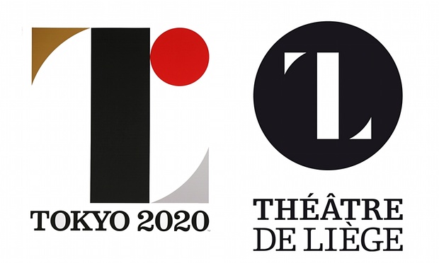
Art has appropriation, design has inspiration or it’s a mix of connecting these visuals to make it work. Akin to conspiracy theories here are my picks for graphic design similarities. That is not to say these are copies of another’s work. I am just amused and trying to pick the brain. An image we caught somewhere, could’ve lingered it’s tails. Or perhaps it’s birds of a feather who tend to think alike as do all great minds? Yet we all have an individuality that transforms something that looks the same into it’s own personality. A square can look vastly different in various context.

The great debate this month was Tokyo’s Olympic Logo. What’s to say that the designer never chanced upon the same image a couple of years back. Somehow leaving a faint imprint on this mind.

Singapore Bus Services Logo in 1978 by Ted Bates and Hillary Clinton 2015 Elections Logo by Pentagram.

2011 London Design Festival Identity by Pentagram ,University of the Arts Helsinki 2013 Logo by Uniarts and NTU School of Art Design and Media Graduation 2014 Show Logo by Factory1611.

Not exactly in the logo sector but I couldn’t resist. The symbol of the eye in the mouth seems to popular too. It’s about being frank and speaking what you see perhaps instead of hiding beneath the layers of obscurity.
Ultimately, it is in it’s application that they become vastly different. The way that it is presented across print, web, signages and space, transforms the experience of a design that first started out as just a logo. So does it really matter that they might have been inspired from each other? Artists have often used appropriation, have based their techniques and methods on old masters and thus it is provenance that should be attributed in which I believe that when these works were presented, it had it’s backing and reasonings behind each. A seed was planted and we see the hybrid of fruits that has grown. Certain harvests turns out sweeter than others.